Redesigning the IKEA Design System
A strategic redesign of IKEA's design system to solve key inconsistencies, improve development velocity, and create a more cohesive user experience.
My Role
Design System Strategist (Bootcamp Project)
Tools Used
Key Skills Applied
Overview
A strategic redesign of IKEA's design system, built during the Memorisely Design Systems Bootcamp. The project focused on solving key inconsistencies and improving development velocity while maintaining the iconic IKEA brand identity.
The Business Challenge
The Challenge of Scaling a Global Brand Identity
IKEA's digital products lacked consistency across platforms, resulting in design inefficiencies, slower development cycles, and a fragmented user experience. The business needed a more robust and scalable system to support its growing digital ecosystem.
My Process
Audit & Strategic Analysis
I began by auditing IKEA's existing digital products to identify and document inconsistencies in UI, spacing, and color. This research formed the business case for a more robust and centralized system.
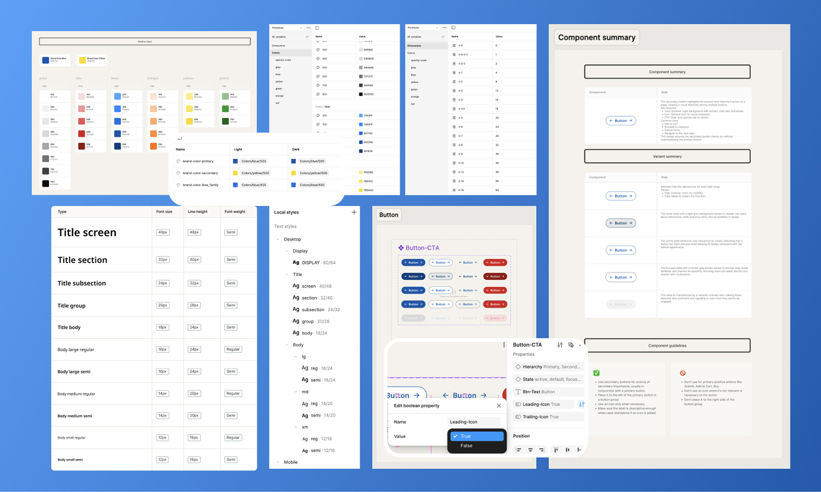
Token Architecture Design
I designed a scalable system of design tokens, creating a clear hierarchy of primitive and semantic variables to ensure both flexibility for designers and consistency for the brand.
Component Development
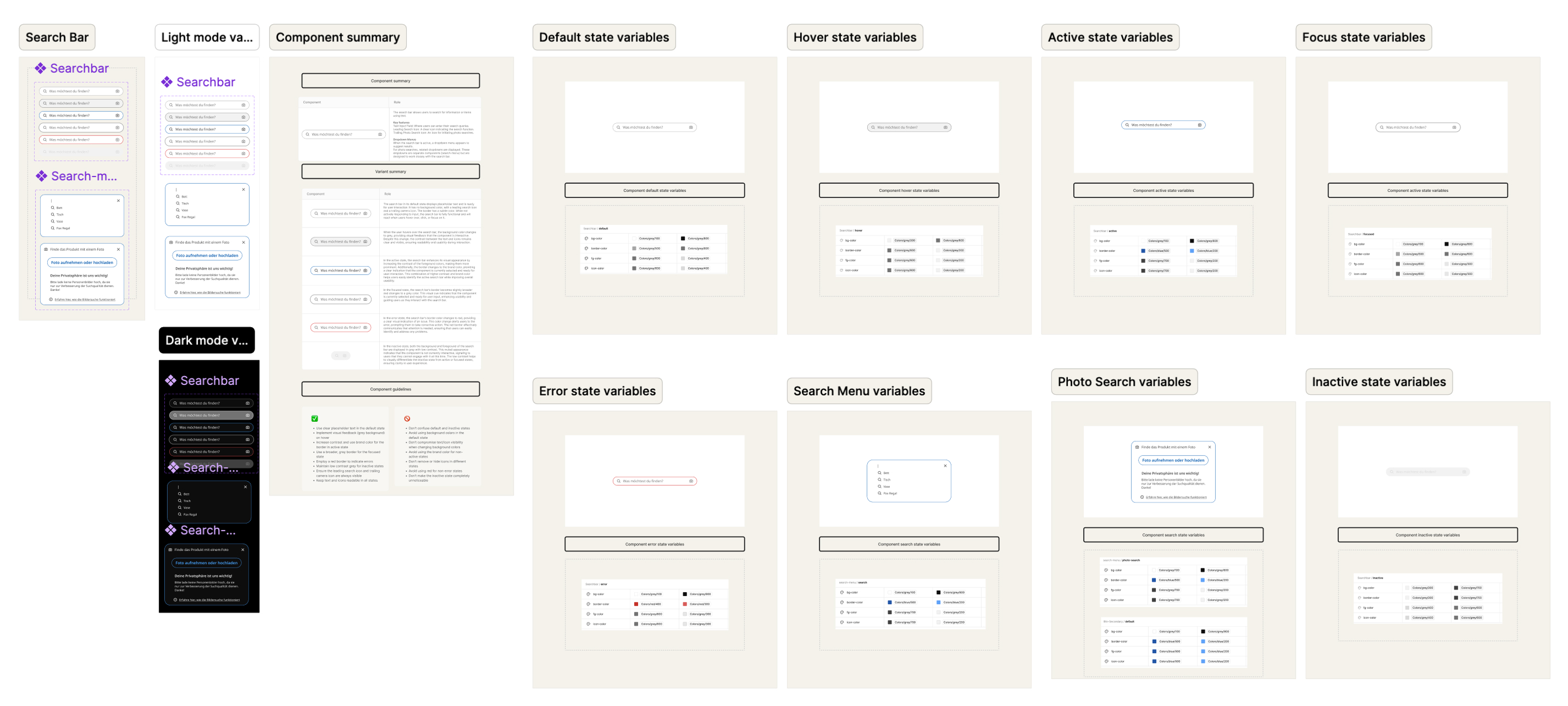
Following Atomic Design principles, I designed and built core components like buttons and checkboxes, defining variants, states, and accessibility standards for both light and dark modes.
Documentation & Guidelines
I developed comprehensive documentation with clear usage guidelines and implementation notes to ensure the system would be easy to adopt and maintain by both design and development teams.
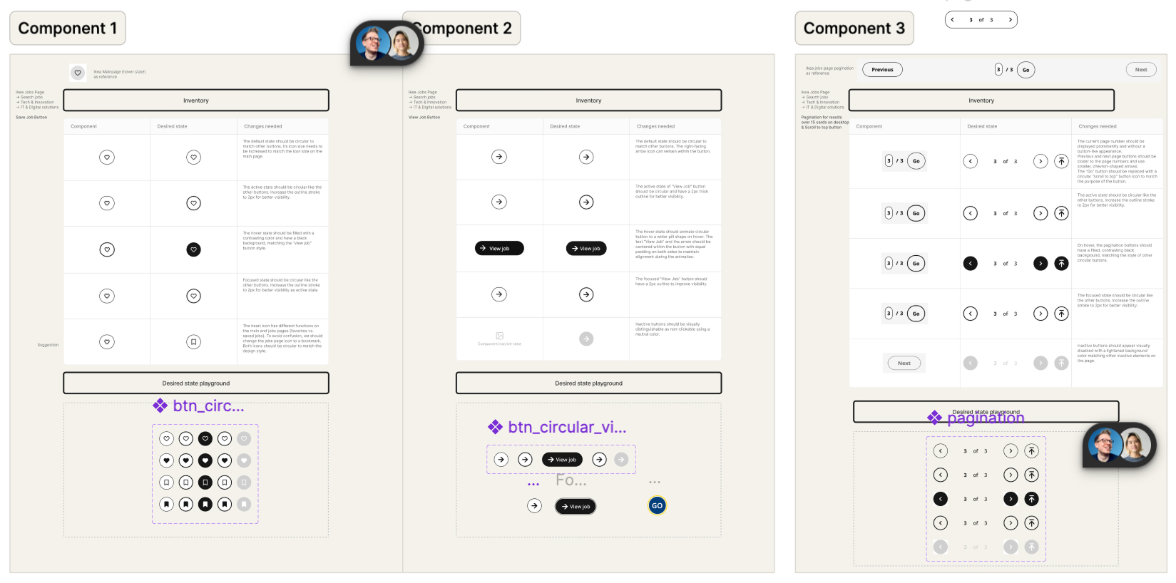
Audit of inconsistencies across existing digital products
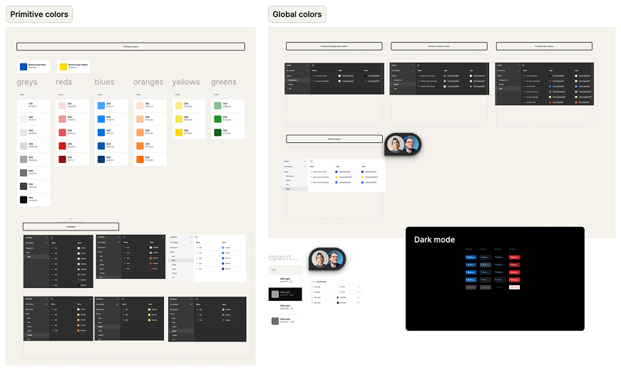
Design token architecture with primitive and semantic layers
The Solution
A cohesive and scalable design system featuring a robust token architecture and key atomic components (buttons, checkboxes, search) with full variant support for light and dark modes, all supported by comprehensive documentation.
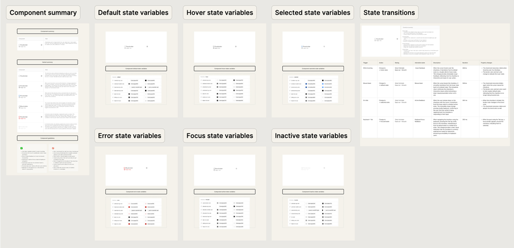
Checkbox component with variants and states
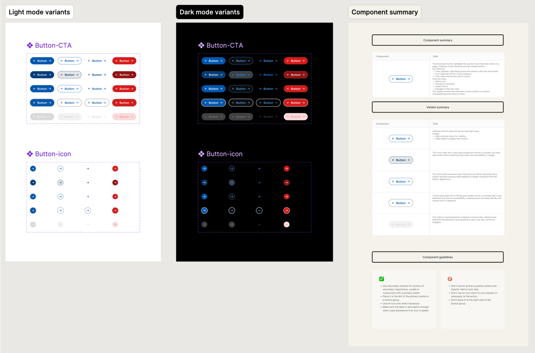
Components in light and dark mode with component guidelines
Documentation site with implementation guidelines and examples

State transitions and animations for interactive components
Impact
As this was a conceptual bootcamp project, the primary goal was to define a system that would drive significant business value. The key success metrics were defined as:
Reduce design inconsistencies across products by 50%.
Increase component implementation speed for developers by 30%.
Achieve a 90% adoption rate among the design team within the first quarter.
Learnings & Reflections
This project reinforced the principle that a great design system is a product in itself, not just a library of components. The key learning was the importance of balancing flexibility with strict constraints to empower creativity while ensuring consistency. My primary strategic recommendation would be to involve developers even earlier in the token architecture phase to ensure seamless technical alignment.